Print Design
OutRide Press Kit
A spot UV splatter texture on black paper creates a wet look, alluding to the waterproof nature of the product while also creating a tone-on-tone effect that looks both premium and rugged. The sides open away from the stationary center which reveals the product and additional branding.
Concept and design by me.
“Play” pattern created by Creative Designer.
In collaboration with Creative Director.
Concept only.
powerstation Press Kit
One, white Lightning cable, prominently displayed in the center among mophie portable chargers and Apple products, highlights the campaign’s theme: The only cable you need.
Concept, art direction and design by me.
Grid image created by Senior Creative Designer, image edits by Photoshop Specialist.
In collaboration with Director of Product Marketing.
Print Ads
A collection of print ads from over the years.
Remember QR codes?
Concepts, art direction, messaging, photography, typography and design by me.
Marketing Materials
Various print posters, one-pagers, and other marketing materials that showcased the brand’s assortment of products and/or detailed technical features.
Layout, design, image edits, and some messaging by me.
In collaboration with Creative Director & VP of Marketing.
Product Catalog
A 44 page catalog featuring branded spreads for campaign launches and standard spreads for products not assigned to a specific campaign.
These were used at trade shows and other events.
In collaboration with Creative Director.
POP Display
Favoring brand presence over optimal peg real estate, neon logos adorn the front and back of the display while only showcasing three hero products. These are powered, allowing and encouraging users to interact with the devices. A limited number of gift boxes hang from pegs below.
Designed to resemble a piece of Mid-century Modern furniture, the display sits on top of a wooden table with hairpin legs. Back stock is stored within the locking drawer.
Concept and design by me.
Concept only.
Club Store Pallet & Pull Card
Designed to be displayed at a club store like Costco or Sam’s Club, a standard pallet is skinned in mophie’s black and green branding. Three key product features are printed on all sides of the skirt to guarantee visibility.
Taking the place of standard retail packaging, pull cards maximize “shelf” space. Since sales associates wouldn’t be walking the floor to assist customers/answer questions, and also because club stores sell a very wide range of products, these pull cards had to introduce the product to a very likely non-tech audience, and explain all product features in a way the average person could understand.
Concept, layout, design, and photo editing by me.
In collaboration with Creative Director.
Packaging
Design, layout, and photo editing by me.
In collaboration with VP of Marketing, Creative Director, and Product Marketing Manager.
Business Card Unification
In order to represent four different brands and up to two offices on one business card, a separate aesthetic for ZAGG corporate was created.
Taking potentially long first/last names/titles and multiple modes of contact into account, the layout had to be open and versatile enough to accommodate these variations.
In collaboration with Creative Director.
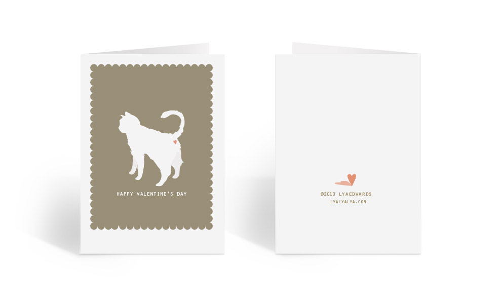
Misc Projects
Various projects from over the years. Mostly postcards, greeting cards, and illustrations.
Illustrations are never live traced.
All things by me.


View more of my work by clicking the links below: