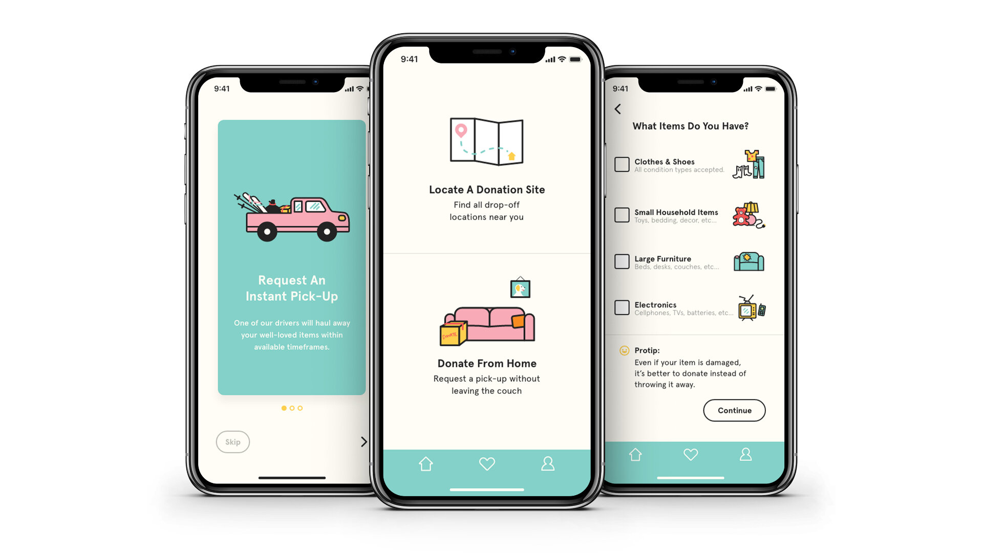
Locate & Donate
An on-demand donation pick-up app with donation site-finding capabilities.
Download full case study:
Here
Problem
When was the last time you wore that velour tracksuit? Do you really ski enough to justify the space they’re currently taking up in your garage?
We all have too much stuff, how do we eventually part ways with our possessions when we no longer need them? How do we do this if we don’t have a reliable method of transportation? Or if we’re just too busy to make a trip to the closest Goodwill? Is the way we donate dependent on lifestyle, charitable values, or awareness of local resources?
After an unpleasant and inconvenient donation experience, I wanted to make a product that:
Would let users locate all available donation bins in their area.
Show all bins, regardless of organizational affiliation.
Users shouldn’t have to hunt for these bins.
If a user was able to find a bin, they should also be notified if that bin had moved, was inaccessible, or was no longer accepting donations.

My Role
Students of the online UX Career Track program at Springboard complete a capstone project that lasts the duration of the course. Every week, they meet with their mentor via Skype to receive feedback.
Knowing this project would be intensive, I wanted to create a product that would solve a problem of personal interest. I recalled a recent disastrous donation process and decided this was a problem I wanted to solve as its resolution would also benefit multiple users.
Development aside, I assumed all roles in the creation of my product. I did primary and secondary research, lead all interviews, and conducted multiple usability tests. In addition to these tactics, I utilized various UX methodologies to identify, refine, and solve my problem. Lastly, I created 100% of the UI, including defining a style guide, writing copy, executing the designs of all screens, and completing various rounds of iterations.

Secondary & Competitive Research

Interviews &
Surveys

Visual &
UX Design

User Testing &
Iterating
Solution
Discovery & Research
Competitive Research
Upfront, a good chunk of time was spent doing research. I conducted competitive research and looked closely at how other apps approached the donation process. I knew I liked the interactivity of a map, and Goodwill added a whole other level of cool by directly relating your donation to the specific good your items will impart (i.e.: 3 bags of clothes = 30 minutes or career counseling for someone like Trevor).
As part of my research, I found articles painting donation bins in a negative light. These articles stated that most bins are skinned with vague “reduce, reuse, recycle” messaging which can mean different things to different people. To some, “reuse” could mean that their beloved-but-ill-fitting coat would be sold to someone in need and worn again. However, some of the companies who own these bins actually repurpose your donated goods by turning that coat into furniture padding or rags.


Secondary Research
I also read articles that reported on the charitable donation process—which I assumed was the most common donation method.
A particular article from The Atlantic stated that non-profit organizations like Goodwill or Salvation Army don’t have enough room at their retail locations for all the donated clothes to be resold.
There is only a 15-20% chance that an item you’ve donated is actually being worn by someone in your community. Whatever can’t be sold in retail will be sold to companies who recycle clothing into rags or furniture padding.
This presented a problem I didn’t anticipate to encounter. I was curious whether the intent of making a donation played a factor in the donation process in general as this might affect the goals of my product. I wanted to know if users were emotionally invested in the journey of their donation, whether they donate to help others in need, or whether they just want their stuff gone.
Download Research Presentation:
Here
Download Competitive Research:
Here

To figure out why/how people donate, I deployed a 16 question survey that was tested on 31 users.


Interviews
An unexpected finding was:
48% of people are absolutely OK knowing that their items will be recycled.
This completely contradicts the response to the question “Is your hope that your item is being used by someone in need”, where 55% of respondents said “Absolutely.”
In order to further understand my users, I identified 6 participants that answered the open-ended questions in an interesting way. Aware of some of the contradictory survey responses I received, I fine-tuned my interview questions. From those interviews, I discovered that:
83% of respondents want to make an impact if given the opportunity, but doing good is not their main motivator.
60% of those respondents would donate with whichever organization/method was most convenient.
Overall, 67% of respondents just want this stuff out of their homes.
I also discovered that:
Only 13.3% of users donate their items via a donation bin.
Most users, at 69%, donate at a donation center drop-off.
Up until this point, my main motivation was to create a donation-bin locator. This data completely changed the goals of the product I wanted to make.
Research Synthesis & Insights
From the surveys and interviews I conducted, I identified four different donation styles that my users could be categorized into:

I then created four personas, assigning these donation styles to each type of user, focusing on their primary needs and major pain points:


Minimal Viable Product
To help me identify what type of product to create, and the types of features the product should have, I created multiple user stories based off my four personas. Doing this also helped me maintain focus on user needs instead of being bogged down by features since I was able to picture myself in the shoes of each persona.
As I continued to develop and leverage multiple UX methodologies, and keeping in mind the fact that 60% of surveyed users favor convenience above all else, one user story in particular stood out to me:
As someone who doesn’t donate because it’s too much work, I want to get rid of my stuff in the easiest way possible.
I realized that the easiest way for someone to do something is if someone else does it for them. I determined that my minimal viable product was to create an on-demand donation pick-up app. As a bonus, the product would also let you find and save all available donation drop-off methods/locations.
Ideation & Sketches
Having identified my MVP, I brainstormed how an on-demand donation service could be effective and effortless. Drawing inspiration from similar services like Prime Now or Postmates, I knew I wanted the user to dictate when the pick-up could occur. I also wanted to make sure that the user felt confident that the items they were going to donate would be accepted by this service.
Thinking more about my user, I also knew the amount of items would also need to be determined. Since I was designing a pick-up service which is traditionally reserved for large items like furniture or mattresses, I wanted to make sure that the user understood that any donation amount would be accepted.
I began sketching the red routes of my user journeys. From there, I created wireframes and wireflows and made quick prototype in InVision.
Wireflows
To make sure I was headed in the right direction, I conducted five guerilla usability tests at a common space at my office.
I discovered that most users tried to click on the onboarding card that was directly related to the task they wanted to complete. I realized this was because under each onboarding card was a “Continue” button which lead the user to think that if they clicked on the button, they would be directly taken to that feature within the app. To solve this, I created a “Skip” button and a next arrow (>) to replace this “Continue” button.
Most users also felt some of my messaging was ambiguous, for example, on the home screen “Locate” for finding donation sites and “Donate” for donating from home meant the same thing to each user because the user wanted to make a donation. I eventually changed these to “Locate a donation site” and “Donate from home”.
Other vague messaging was “Instant” for an on-demand request and “Not Instant” for a scheduled pick-up request. I changed this to “Today” and “Not today”.
Wireflows for Flow #1
Wireflows for Flow #2
Mood Board & Style Guide
View Full Mood Board:
Here
After my guerilla usability tests, I was ready to start working on the UI. I developed a Mood Board and Style Guide, favoring bright colors to reflect the joy and relief from completing a donation because for some the decluttering and donation process is very much a chore. I also knew I wanted to use a lot of delightful illustrations to create an air of positivity to combat any feelings of anxiety associated with a user getting rid of their items.
User Testing & Validation
After finishing my high fidelity screens, I created another prototype and conducted my first round of usability tests where I tested four individuals at a local alehouse. From my tests, I identified three major issues and solutions.

Issue #1:
Users assumed onboarding cards were part of the navigation.
Solution:
Make onboarding cards clickable/part of the navigation.

Issue #2:
Once the user got to the product page for a donation site, they didn’t realize that the page scrolled.
Solution:
Simplify screen and keep everything above the fold/the page doesn’t scroll.

Issue #3:
Once users completed an instant pick-up request and received a confirmation, they were unsure how to get out of that screen.
Solution:
Create additional button labeled “Exit Screen”.
After making the changes from my first round of usability tests, I conducted another round with five participants over the course of a few days. Overall, tests improved and there were fewer issues.
Users were still having problems with the onboarding screens. I believe part of this is because my in-person tests were conducted on a 1st generation iPad mini that can’t update with the latest version of iOS which also means it is unable to update with the most recent version of the InVision app. Because of this, the splash screen would never load when the user began the usability test (tests would start with the first onboarding card). I conducted one remote test with a user on a desktop and he was able to see the splash screen animation and therefore understood the onboarding cards were a walkthrough and not part of the navigation.
To solve the continual issue with the onboarding cards, I would explore animations or overlay effects to signal to the user that onboarding has started.
The second issue was that the “current location” was unclear on some of the map screens. The “current location” was meant to be the user’s home address, so the solution for this issue would be relabel “current location” with “home”.

Issue #1:
Users still assumed onboarding cards were part of the navigation.
Solution:
Explore animations or overlay effects to signal onboarding has started.

Issue #2:
“Current Location” is unclear to users (this is meant to be their home address).
Solution:
Relabel “Current Location” with “Home”.
Conclusion & Takeaways
The responses I received during my usability tests confirmed my assumption that a product like Locate & Donate would be valuable to the public. While my initial problem differed from my final product, I was able to identify and create a solution using multiple UX methodologies to develop an app aligned with user needs. My biggest takeaway: The product you want to create may not be the right product to create for the user.

There were multiple directions in which I wanted to take my product. However, due to limited resources and palpable time constraints, I had to focus on the MVP of creating an on-demand donation service. If time were not a factor, I would have explored avenues that would give users insight to how their donations directly benefit the environment or their community. Designing enhanced functionality in the onboarding process would also allow users to identify charitable organizations that are aligned with their beliefs. Regardless, I believe I created a viable product that can solve a real world problem.